The break lasted exactly one Monday.
What got done yesterday? Nothing worth counting: not a commit, not an open project.
Today I hauled myself back by the collar.
🎸 Spring is declared early
I have been in this spot before. Not in this project — in life.
Seventeen years ago my first long relationship fell apart. More than two years of it. I got to the point where it was clear there was nothing left for me to do, and that what came next was going to hurt.
You don't mistake that moment for anything else. Effort is useless, and all that's left is to live through it — the pain, the winter, all of it. Then spring arrives and life starts running some new way.
And right on cue, I was made redundant as well. In December.
An excellent setup for lying down and not getting up until March.
Then I thought this.
Spring isn't coming today. But let's pretend I have already done my couple of months of moaning. What's left?
What's left is that I don't have to be at work on the second of January. An unreasonable amount of free time appeared out of nowhere. And money: they had paid me a month in advance.
Which is to say I was holding a resource I hadn't had in years.
That year, spring was declared on the twenty-seventh of December.
Did it still catch up with me afterwards? It did, I won't pretend otherwise. But that is also when I bought my first guitar, and had a couple of genuinely good months.
I didn't manage to bring the real spring any closer, obviously. But a chapter started that would otherwise have hung there until summer.
Same thing here.
The job is big, doing it is hard, and there's no time for it. So you take it by whichever edge is nearest and pull — in the opposite direction from where the abandoned repository lies.
I never did finish that book. But the title works.
Screw it, let's do it.
🗂 Kanban without tickets
I had no system for any of this — and honestly, that is half the reason I got up from the desk yesterday.
When everything annoys you at once, you can't work out what to take hold of. Every choice feels like the wrong one, because there are ten more exactly like it lying next to it.
So today's strategy is simple, and it isn't out of a book.
I get up and start redoing whatever I don't like.
In no particular order. No list, no priorities, no estimates in hours.
Exactly one rule: a problem has to be either solved or closed.
Closed means solved somehow, anyhow, just so it stops hanging there. I'll come back to it when the ones that spoil the experience more have gone.
Ordinary kanban, only without tickets. Two columns: "I don't like this" and "fixing". The cards are my own irritations.
By the evening the list looks like this:
- 🟡 the sign — closed, not solved
- ✅ blocks don't shiver any more when you drag them
- ✅ my own colour control instead of the system one
- ✅ the three regressions it dragged in behind it
- ✅ settings: one panel instead of two
- ✅ a new window header
- 🟡 three faults in the vault — closed, not solved
Five ticks and two ambers. Amber isn't "didn't get to it". Amber is "solved exactly enough to stop it hanging there".
There's no sense walking the whole list. I'll take the ones that turned out interesting — starting with what you see first.
🪧 The sign
Built it. Ran it.
And a grey rectangle with no picture turned up in the dock.
There was no icon at all. Not one, not at any size — the project held an empty set, and the system dropped its own blank into the dock.
In fairness: the prototype's sign is a placeholder too. Two bars and a cursor — exactly enough to stop the dock looking empty.
There was no point carrying it over. It's the sign for a different building.
Which is a fairly precise metaphor for everything that has happened so far.
Inside: boards, vaults, encryption, a green test run. Outside: a building with no sign.
Today the sign appeared. A full set for the Mac, every size, light and dark.
Seeing your own project's icon in the dock is a pleasure, I won't pretend otherwise.
I'd just rather what stood there were something meaningful, and not a placeholder.
And I don't like it.
I gave it an honest go. Threw a set of options together, drew by hand, took the drawing into vector. All of it misses — you can see that at once, even though I still can't say what it is supposed to hit.
Spending a day on this today is a bad idea. The sign is in the way of nothing that's inside, and there is nowhere to walk into yet.
So the decision is: take the neutral one. Let it just be there.
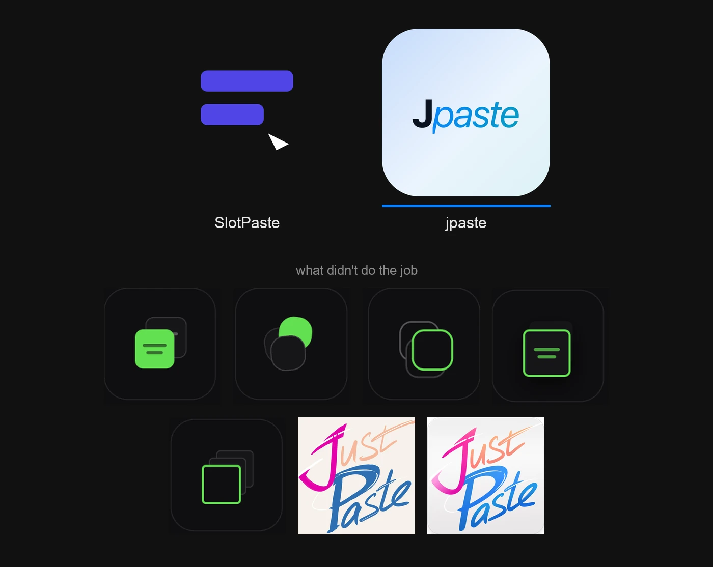
And it has a slip in it that I can't now unsee.
The tail of the "p" is cut off. Flat and square, as though the picture had been trimmed with a ruler and the ruler was a millimetre out.
My inner perfectionist howls at it.
Any sign at all is better than no sign.
An empty placeholder doesn't irritate. It's nothing, the eye slides off it. This one will catch my eye every time I launch the app, and remind me every time that the question is still open.
Let it annoy me. As a reminder it works better than a line on a to-do list.
And, separately, a set for iOS.
(Why a Mac app has an iOS icon, I am not explaining today. Including to myself.)
🪤 The block that measured itself against itself
And now the best bug in the project's history.
The canvas scales. So everything lying on it is drawn through a factor, and the coordinates inside it don't live in screen pixels, they live in their own.
A block being dragged with the mouse worked out its new position relative to itself. Relative to its own frame — the one that had already moved by then.
Which gives you a loop.
The block shifts. The frame shifts with it. The next measurement is taken from the frame that has already shifted. The shift subtracts itself from itself.
From the outside it looks like this: the block crawls after the cursor at half the speed it should, and shivers.
Half — because it was eating half of every movement itself.
The cure is to move the point of reference: measure from the fixed container under the canvas, not from your own frame.
And the moral of it, which I like: an object cannot be the point of reference for its own movement.
Not on a canvas, and not anywhere else.
🎨 The colour control that broke its neighbours
A block gets a colour. Next to the ready-made circles stood the system colour picker — Apple's own, nothing to draw.
It didn't work. And not on its own account — it broke its neighbours.
There is a native element inside it, and its mere presence in the row switched off taps for every other circle. The circles drew. The circles highlighted. The circles did not press.
And when the system picker did open, it arrived as a separate system window on top of ours. And ours is built not to take focus — otherwise it would steal your work every time you used it.
Two windows with different ideas about who is in charge here.
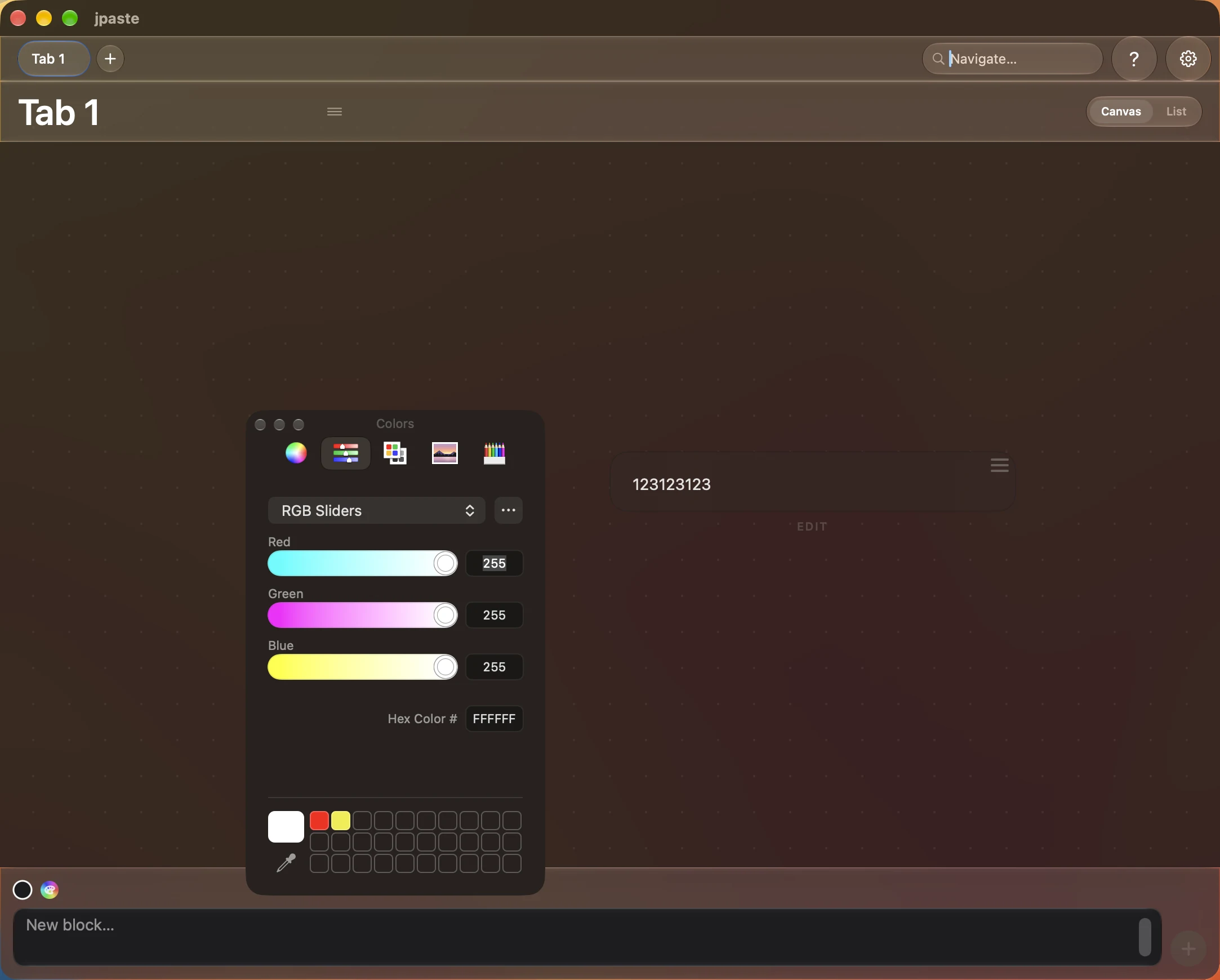
Took it out. And then came the part I like most in this work: fiddling with variants.
First it was just a strip of the current colour, right there on the block. Then we worked out that the strip itself could be the control — you poke it, and the colour changes in the same place you are looking at it.
Trial and error until the result stops irritating. With no attempt to solve it all forever: the colour field in the settings is still half-crippled, and I didn't go near it today. There's no sense going deep before you reach the point of polishing the settings.
And this is the first time "take the native one" turned out to cost more than making it myself. The frozen decision — native frameworks only, no third-party libraries — I didn't break. The strip is drawn with the same native tools. Just not with a ready-made control.
A difference I couldn't see until today.
🧹 Settings with no bottom
And this one is my own unsolved problem, carried in from the prototype.
Settings lived there in a single file for the whole app. And it had bothered me for a long time that every tab had the same background: the tabs are about different things, and they look identical. How to arrange that properly, I didn't know.
Here I finally had a chance to try. I tried.
Settings panels became two. App settings and tab settings.
In each of them, the same eight appearance parameters. Globally, and separately for every tab. And a toggle above every override.
Eight settings, two places, eight switches on top.
Sixteen ways to set eight things.
That is what made the settings feel bottomless. Not the number — the number is actually small. It is that every setting lived in two places, with a switch between them deciding which of the two was true right now.
You have to give people the ability to customise. Just not by turning it into the remote control of an old television — the one with so many buttons that you can't remember what any of them does.
I had built the remote.
Today one panel is left, split into two parts: board and app. One control per setting. The concept of "override" is gone from the interface.
I didn't add a single capability. I removed one concept.
That's the second time. The first was when I threw out collision detection and wrote that sometimes the right optimisation is a deletion.
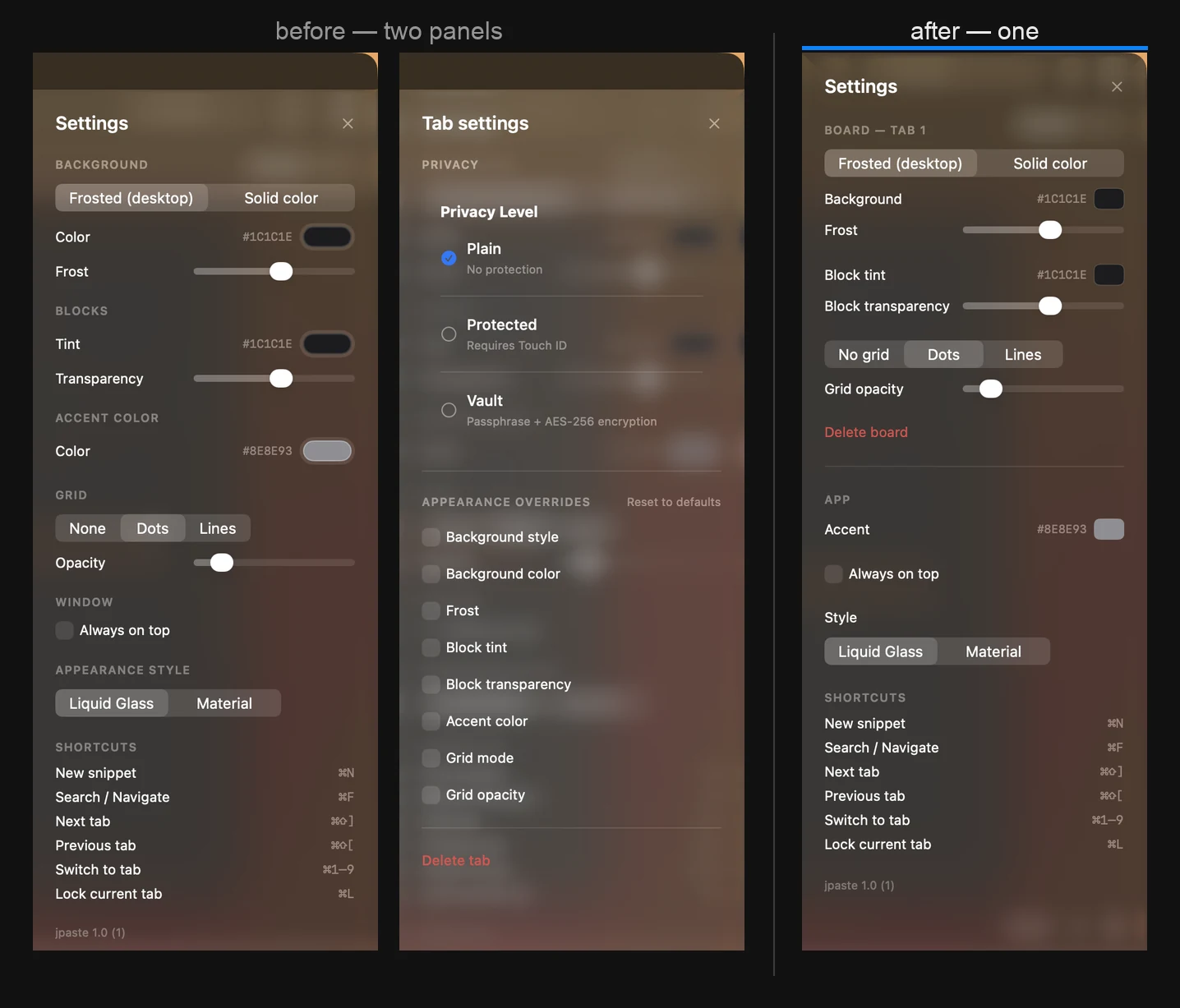
And the second time it turned out to be the best change of the day.
🔌 Engineer honesty moment
Three faults in the vault. And I was looking for none of them.
The vault barely concerned me today: I was taking the settings apart, and it happened to be lying on the way. I wanted to clear the obvious things without going inside it. I still haven't tested it seriously — when I sit down to test it, that is when I'll want to finish it.
The first. The vault service didn't announce itself outward. A board got locked — and the screen never found out, so a locked board carried on showing its contents until something unrelated forced it to redraw.
The third case in a row, if you're counting.
A vault with no encryption. A toggle that switches nothing. A lock that is locked and looks open.
The second. The passphrase form opened from inside a popover. And macOS closes those along with their owner — which is to say, right in the middle of setting a passphrase.
The third, and the nastiest. The tab switched into vault mode before the passphrase existed at all. Press cancel, and you are left with a board whose lock accepts any input.
And here is what I think about that, given the day was about every problem being either solved or closed.
All three are closed. Not one is solved.
I took away what shows from the outside and didn't touch what sits underneath. Because I wasn't checking the vault today. I was walking past it.
So today's "I don't like this" list didn't get any shorter. It just got more honest.
🎤 In passing
I had a presentation today. Not about this project — for the day job.
And so that everything I might need was to hand, I made myself another tab and threw a dozen snippets into it.
A dozen lines I would otherwise be holding in my head, or hunting for at exactly the moment people are watching you.
The cognitive load dropped straight away. Not "it got more convenient" — it dropped.
And here is the awkward part.
What saved me was the prototype. That one, in a browser, made of sticks and string.
And the thing that has taken two hundred hours would have saved nobody today. You still can't properly put text into it.
The prototype is better than what I am building. On every count.
Which, looked at soberly, is normal for this stage. It's older, it has been through two months of daily use, and it was edited by hand. Here I edit nothing by hand: it all goes through a proxy, and the proxy is called AI.
But that isn't really the point.
The prototype was a stool made of sticks and string. Knocked together in a week, working, and it was enough for me.
Into this one goes the whole of humanity's experience of metallurgy and material strength — so that the stool, while remaining a stool, is reliable, safe, and lasts.
No armrests, no lighting, no seventeen adjustments. One thing that does one thing. Just built so it doesn't fold under whoever sits on it.
That is what the difference is paid for.
What looked like overspend yesterday isn't overspend. It's the price.
Not to be got round. Not to be optimised. Accepted.
And that is exactly why I can't drop it. The thing that takes the load off me every day already exists. The only question left is whether I get it to the state where somebody other than me can use it.
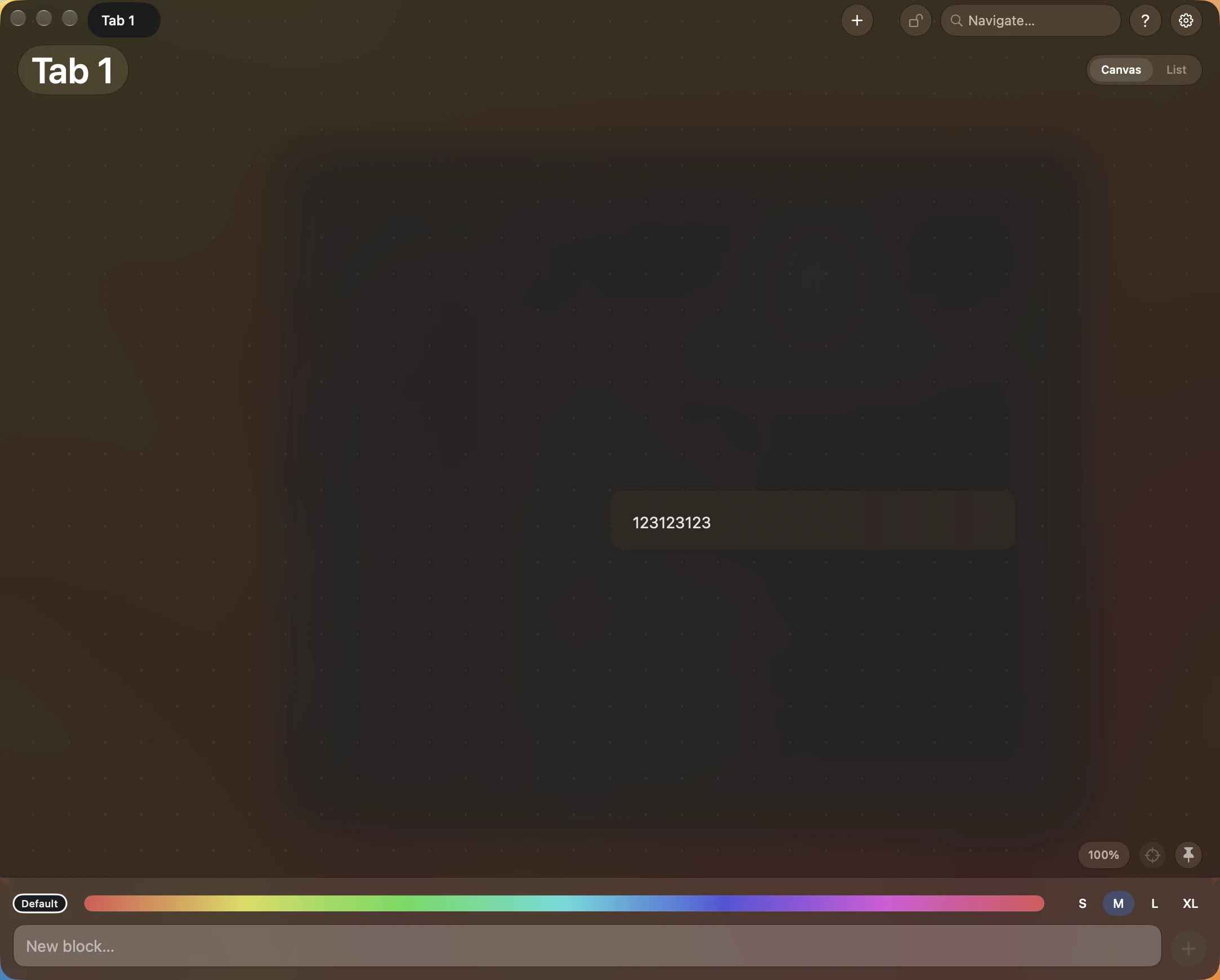
This is the way.
💬 A question
How many of your projects made it to a state you'd show somebody?
There are thirty-eight repositories on my GitHub. Eight of them got there, at a stretch. And that is counting the couple of times I've tidied the account of things I didn't mind losing.
So yesterday's "do I drop this or not" isn't drama, for me. It's routine, and it happens to everybody who starts anything at all.
The question isn't how to stay out of it. The question is what you do once you're in it.
Today my answer is: take it by the nearest edge and close something.
Tell me how it goes for you 👇
Next on the list is the price. Tomorrow I sit down to the purchase screen.
Deciding what to ask for it frightens me more than building it 😉