Yesterday I signed off with a nasty suspicion: fifty-nine files in one pass don't go through without leaving a mark.
They didn't. But that's not today's story, so I'll keep it short.
🌙 The night review
Overnight, three reviewers read yesterday's change. All three were AI, and none of them had written it. Each had one job: find what broke.
They found eleven defects. Two were old — nobody had looked in that direction before. The other nine came from yesterday's cleanup itself.
The window hid from screen recordings — but the pop-up editor on top of it didn't.
The free limit was counting a number that had already gone stale.
A drag got lost if the card slid past the edge of what was on screen.
And quitting the app saved nothing.
On day five I wrote that the AI would carry it. As long as it isn't the one checking itself.
Today that condition played out exactly as written. The one doing the fixing missed nine of its own mistakes. The one that hadn't touched it found them overnight.
By morning it's all fixed. A hundred and three tests green, and a build without a single warning.
🖥 Almost done
Now, the actual story.
I look at jpaste for Mac, and I don't see a construction site anymore. I see an app that's almost done.
It sits next to the window I'm pasting into and never takes its focus. Click a snippet and it's on the clipboard — and I never left my email.
Hover over a card and four small buttons appear in its corners: move, edit, delete, resize. Move the mouse away and they're gone. Only the text is left.
Those four little circles have a small story behind them.
In the prototype I use every day, a card looked like this.
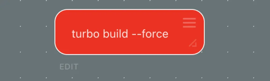
And delete was hidden inside edit.
I spent a while working out the right shape. First, delete got its own button: it's awkward when you have to start editing something just to get rid of it. That made four actions. So I packed them into the four corners, one each, and made them show up only while the mouse is over the card.
Today I changed exactly one thing about it: the icons on the buttons were too faint. You could see there was a button, but you had to guess what it did.
Now the circles are light, the icons inside take the card's own colour, and the delete cross is red.
That's what "almost done" means. You stop building and start tightening screws.
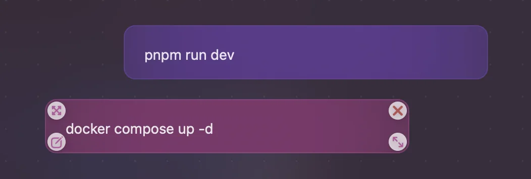
Scroll the wheel and the board zooms in towards wherever the cursor is. Right-click for a menu.
I like how it looks. Nothing extra until you need it.
But notice: almost all of it runs on the mouse. That'll matter in a couple of sections.
Today the AI wrote me the next plan. Its first sentence: "The macOS app is complete."
I'd have said "almost". But I didn't argue. Because the next plan isn't about the Mac.
📺 The screen across from the office
Across from my office there's an arena, and on it a huge screen. All week, literally every other ad on it has been the new iPhone Duo.

It doesn't go on sale for a couple of weeks, and it's already everywhere. And it seems to have pulled the attention away from the new iPhone Pro already.
For the last three or four years, getting a Pro among the first was a real task. Every year there was something to chase: the Dynamic Island, the titanium body, a whole new design on the 17. You waited weeks, sometimes months.
This year I checked on purpose. I walked into the nearest Apple Store — and I could buy the new Pro today. Any colour, almost any storage.
Looks like buyers have decided to go for the new phone rather than the next iteration of the old line. Which makes perfect sense.
No, I'm not buying one. The price is out of its mind. And with a recent iPhone and an iPad already in hand, there's not much point in a device like that for me.
But I look at that screen and think about something else.
jpaste fits the iPad perfectly. And this is, more or less, an iPad that folds into your pocket. Which means jpaste fits the loudest device in the news cycle too.
And that's where the real question is: how much will it cost?
🧮 A hundred, plus sixty
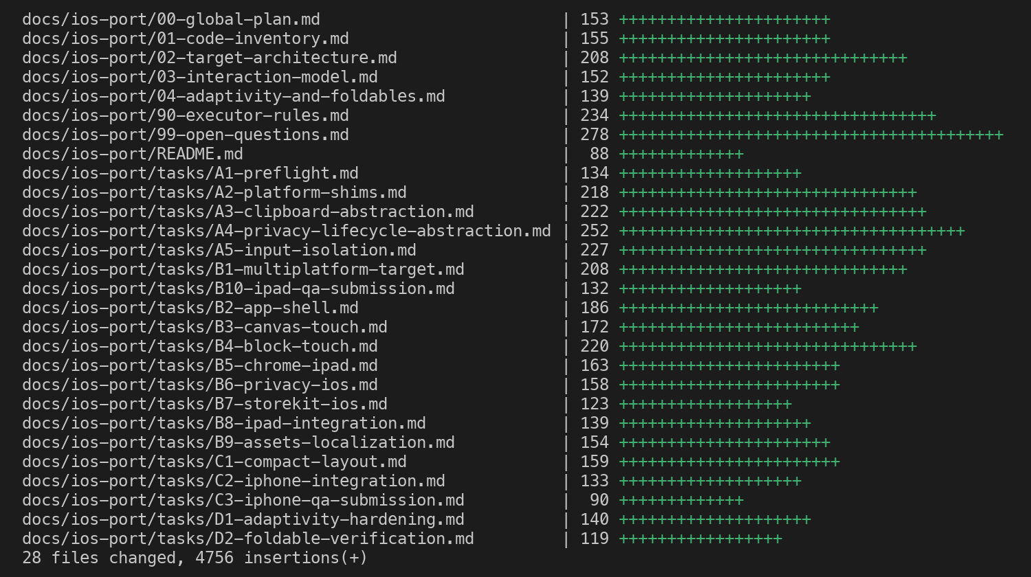
Today I got an answer to that question, twenty-eight files long.
The plan for bringing jpaste to iPad and iPhone. Four phases, twenty tasks, nine questions only the owner can answer. And not one line of code.
The math comes out roughly like this. If the Mac work is a hundred story points — the units teams use to size work rather than count hours — iOS adds somewhere around sixty on top.
That looks acceptable.
The phases go like this. First, make the code portable without changing anything at all on the Mac. Then iPad. Then iPhone. And the last one: holding up on screens nobody has seen yet.
That last one is where I stopped.
The model that wrote the plan says it plainly: a folding iPhone has long been rumoured and isn't confirmed. Its knowledge ends before the device was shown. It doesn't know what's hanging across from my office.
And it doesn't try to guess. Instead, the plan requires the app to make no assumptions about the shape of the screen at all. Not from the device model, not from a width in points.
An app that doesn't know what screen it's on can't be caught off guard by a new one.
I like that better than any accurate guess.
💰 One price tag
The first of the nine questions: one app or two?
Two means a separate store page and a separate purchase for iPad and iPhone. One means one page, one price, one purchase across every device.
Separate purchases make no sense. I want iPad and iPhone to be not a second product but one more reason to buy the app at all.
I'm not aiming at a one-dollar purchase, after all. Which means I have to give value per square metre of the money I'm asking for. Ask for more, give more.
Two days ago I wrote: "I'm not greedy about platforms." Today that stopped being just a line.
The second question: when.
The AI recommends starting with iPad. The product has a complete story there, and it's forty to sixty hours less work to the first release. iPhone comes later, as an update.
I'm going the other way. iPad and iPhone go into the very first release.
One wave instead of two. And nobody opens the page, sees "iPad only" and walks away.
The decision has a cost, and it should be named.
The Mac can no longer ship without the phone.
The price is the same everywhere — even if it turns out awkward on one of the devices.
And the rating is shared. If the iPhone version comes out weak, it drags the Mac down with it.
On day two I wrote in the spec: "Mac first. iPad and iPhone in version two."
The Mac is still first. But there won't be a version two for them. They're coming in version one.
👆 There's no hover on an iPad
Now, why those sixty story points aren't just a redraw for a different size.
On the Mac, the whole product is a window that sits alongside and never takes the focus. iOS has no such thing. An app is either on screen or it isn't.
On iPad the promise mostly survives. Two apps side by side, and you can just drag a snippet with your finger to wherever it needs to go. No clipboard involved at all.
On iPhone that won't work. The honest phone version is "copy here, switch, paste there". And the whole job is making that trip as short as possible.
Now remember the mouse.
Four buttons that appear on hover. Zoom that follows the cursor. A menu on right-click.
On an iPad, practically none of that exists. No hover. No cursor. No right-click.
So the buttons have to appear on a touch — and not get in the way of dragging. Zoom becomes a pinch, between the fingers. The menu becomes a long press, which must never be mistaken for the start of that same drag.
What I polished on the Mac won't carry over neatly. The answers have to be found again.
All in all, there are a lot of interesting interface questions ahead. Time will tell how well I answer them.
🔌 Engineer honesty moment
Since we're talking about that screen.
Part of this decision isn't about the product. It's about timing. A device that's basically an iPad is starting its expansion, and it's worth getting onto it early. That's calculation, not love of hardware.
And second. Filling a board with text on a phone — folding or not — isn't the most comfortable thing to do. Hardly anyone will write long snippets there.
But as a tool that keeps a pack of the data you need right at hand, it'll work well. No doubt about it.
That's exactly what the iPhone version is for. I'm building it for the second thing, not the first.
💬 A question
One app, three devices, one price.
Is that a reason for you to buy a small paid app? Or do you consider it the default, nothing worth paying for?
Tell me how it goes for you 👇
Tomorrow is phase one. Make the code portable without changing anything on the Mac.
A hundred and three tests have to stay green. I have a feeling AppKit sits deeper in this code than it looks 😉